Dockable Views
Tools
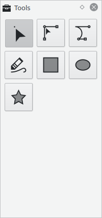
This view allows you to select the active tool.
See Tools for details on how each tool works.
Tool Options
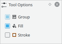
This view shows extra option for the currently active tool.
See Tools for details on how each tool works.
Fill
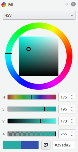
This view allows to select / modify the current color.
The top part has different tabs to change which color space to use (or to use palettes).
The bottom part stays the same:
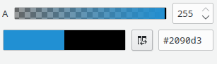
The "A" slider changes the color opacity (Alpha).
The two color indicators show the main (fill) color and secondary (stroke) color.
Clicking on either of them shows a dialog which gives similar controls as the ones in
the view, but more compact. And also allows picking colors from the screen.
The Swap button  swaps the two colors.
Finally, there's a textbox with a hexadecimal representation of the main color.
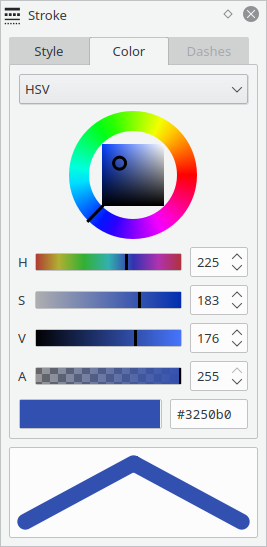
HSV
Colors selectors in the HSV space (Hue Saturation Value).
The color can be adjusted with the color wheel or individual channel sliders.
HSL

Colors selectors in the HSL space (Hue Saturation Lightness).
The color can be adjusted with the color wheel or individual channel sliders.
RGB
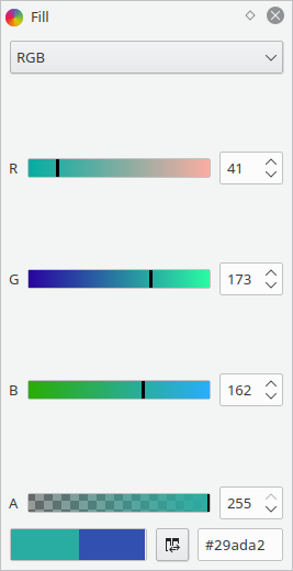
Colors selectors in the RGB space (Red Green Blue).
The color can be adjusted with the individual channel sliders.
CMYK
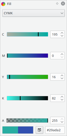
Colors selectors in the CMYK space (Cyan Magenta Yellow Black).
The color can be adjusted with the individual channel sliders.
Palette
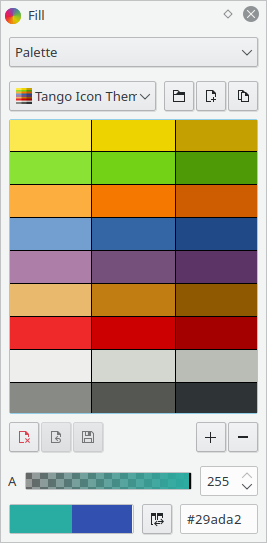
Here you can select, create, modify color palettes.
Opening and saving supports Gimp Palette files (.gpl).
Clicking on one of the colors, selects it as the current color.
Stroke
This view shows various stroke (outline) settings.
Stroke Style
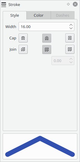
At the bottom it shows a preview of the current settings.
The "Width" spin box determines how thick the stroke is.
The "Cap" buttons determine the style of the ends of the line.
The "Join" buttons determine the style of sharp corners.
The spin box after the "Join" buttons determines how far a Miter join can reach.
Stroke Color
This tab selects the stroke color in a similar way as to how the Fill View selects the fill color.
Layers
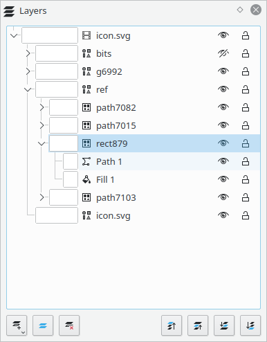
This view shows layers and shapes.
From here you can rename them by double clicking on their name. You can hide and lock them by clicking on the eye and padlock icons respectively.
You can also select a grouping color by clicking on the rectangle to thee left. This has no effect other than changing how layers are shown in this view to help organize them.
Context Menu
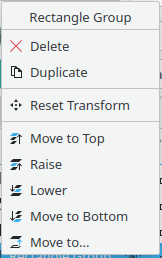
Right clicking on an item will bring a context menu with quick actions for that item.
Timeline
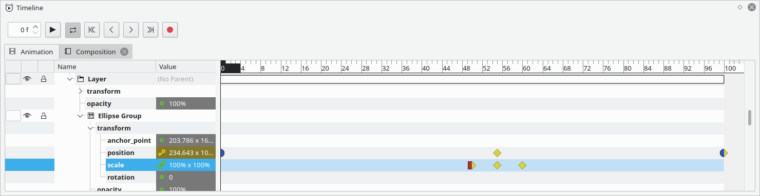
The timeline view allows to manage keyframes for the animatable properties of the active object.
Playback Buttons
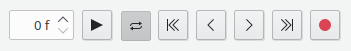
At the top of the Timeline view shows the current frame, and various playback buttons.
The frame spin box shows the current frame, and allows jumping to a specific frame by typing its number.
 Starts and pauses playback
 Toggles whether playback loops the animation
 Jumps to the first frame
 Jumps to the previous frame
 Jumps to the next frame
 Jumps to the last frame
 Record keyframes. When enabled, all changes made on the canvas are added as keyframes.
Composition Tabs
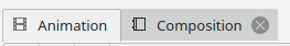
If you have multiple compositions in the current document, they are shown in a tab bar above the property list and timeline.
Clicking on the tabs will switch to a different composition.
Property and Object List
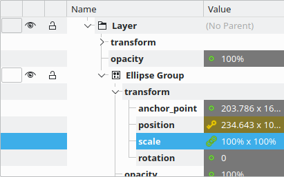
On its left handside, the the Timeline view has the list of objects and properties.
For shapes and other obects, it shows their group color, visibility, lock status, and name. All of those can be modified from the timeline itself.
Additionally, top-level layers can also have a parent, which is also shown and edited from the timeline.
Nested inside each object, you can see their children and properties.
Properties show their name, current value, and animation status.
The animation statuses are as follow:
 Not animated
 Currently on a keyframe
 "Tweening" value, between keyframes
 Animated value that has been moved without adding a keyframe
Keyframe Timeline
The right handside of the Timeline view shows the actual timeline.
Pressing left/right arrow keys changes the current frame when this area is focused.
Time Bar

The bar at the top highlights the current frame. Clicking or dragging with the mouse will jump to the frame whose number is under the mouse cursor.
Keyframe Area
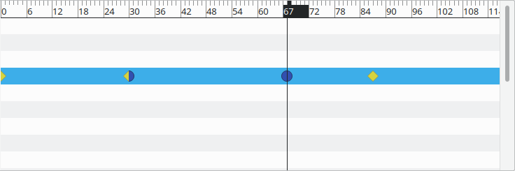
Under that, there are rows for each of the animatable properties, and icons showing the keyframes for said properties.
The keyframes icons can be selected by clicking (To select multiple Shift-click or Ctrl-click). and dragged with the mouse to change their time.
The keyframe icons show different shapes and colors depending on the easing transition of the keyframe before and after the icon.
 Linear, values change from the start to the end of the keyframe at a constant rate
 Smooth Easing, values change more slowly at the start or end of the keyframe
 Hold, the value remains constant until the next keyframe
 Custom curve, defined with the dialog described in Custom Easing Dialog
Ctrl + Mouse Wheel will zoom the area with respect to time, Mouse Wheel by itself moves left or right. To scroll up and down either use the scrollbar to the side or use the Mouse Wheel on the property list.
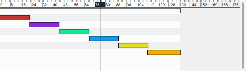
Layers will be displayed as rectangles that spans between the first and last frames of that layer:
Context Menus
Right clicking on the row of a property, will show a context menu with the name of the property and the ability to add a keyframe:
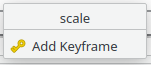
Clicking on "Add Keyframe" will add a keyframe at the current frame with the current value of the property.
Right clicking on an existing keyframe icon, will show a menu with options relating to that keyframe:
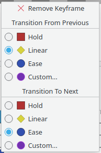
Clicking on "Custom..." for the incoming or outgoing transitions will show the Custom Easing Dialog.
Custom Easing Dialog
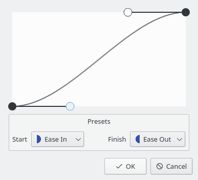
This dialog gives full freedom to specify easing curves.
The curve represents how the value changes between two keyframes: the horizontal axis represents the time between the two keyframes and the vertical axis is the interpolation factor between the two values.
To choose a preset transition for one of the two ends, you can select a value from the dropdowns.
Align
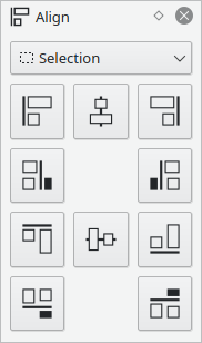
This view shows alignment options, the same actions are available in the Align Menu.
The dropdown selects whether to align based on the selection bounding box or the canvas, the buttons are the various alignment options.
Properties
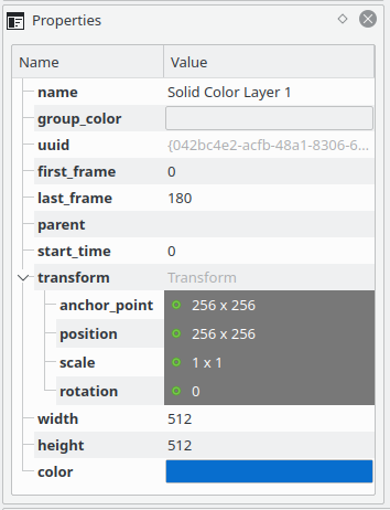
The Properties view allows the user to view or modify any property of the active object.
To edit a property double click on its value.
Animatable properties are highlighted as explained in Property List.
Undo History
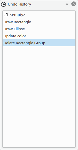
This view allows you to see the action history for the current document, clicking on the listed actions will revert the document to that action.
Useful for when you want to undo or redo several actions at once.
A little icon will be shown next to the action corresponding to the last time you saved the document.
Gradients
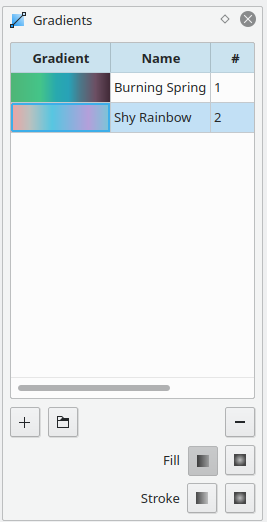
This view shows the gradients used in the document.
It's hidden by default, to show it use the View > Views > Gradients menu action.
At the top of the view is the list of gradients, showing a preview, its name, and the number of shapes using it.
Below that, you have a few buttons:
 Adds a new gradient based on the current colors.
 Adds a new gradients from a list of presets.
 Removes the selected gradient.
Then buttons to apply the selected griandient for fill or stroke:
 for a linear gradient.
 for a radial gradient.
Click on the checked button to remove the gradient from an object.
Presets
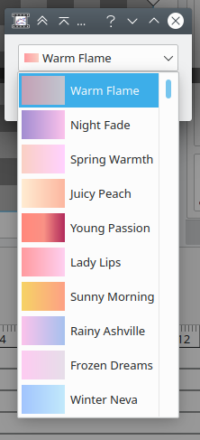
This menu shows a drop down with the available presets, based on https://webgradients.com/.
Editing from the List
You can rename gradients by double-clicking on their name and typing a new name.
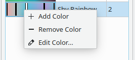
Similarly, you can double click on the preview to make it editable:
While in this mode, you can drag the lines representing the gradient stops to move them, drag them off the rectangle to remove them, and double click to show a dialog to set the color.
Right-clicking shows this menu:
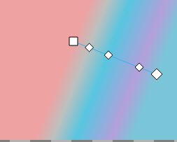
Editing from the Canvas
With the edit tool active, the gradient controls will appear on the canvas.
Dragging the end points will change the extent of the gradient and dragging the smaller handles will change the offset of the corresponding gradient stop.
For a Linear gradient:
For a radial gradient:
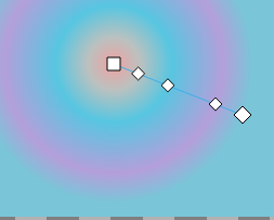
When you have a radial gradient, you can shift click on the start handle to reveal a new X-shaped handle that controls the highlight position for the gradient:
To hide it again, shift-click on it.
Swatch
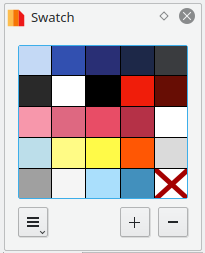
This view shows the colors in the document swatch.
The document swatch is a palette specific to the open document. When an object is assigned a color from the document swatch, it gets linked to it. Modifying the color in the swatch will reflect the change in all linked objects, so you can recolor multiple objects at once.
The view shows the palette for the document swatch, which each color in its own rectangle. There is an extra rectangle that's used to unlink the selected object from the swatch (the object will retain its color but modifying the swatch will no longer affect that object).
These are the buttons at the bottom:
Clicking and holding on this button will show a menu with extra options.
Adds the current fill color to the swatch.
If an object is selected, its fill color will be linked to the swatch.
Removes the last clicked color from the swatch
Swatch Extra Options
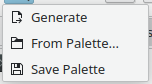
 Generate
Pulls the colors off the open document and link all objects to the swatch
 From Palette...
Shows a dialog with option to populate the swatch from an existing palette.
 Save Palette
Saves the swatch and it will show up as a palette in the Fill and Stroke views.
Mouse interactions
Left-clicking on one of the rectangles of the swatch will link the fill color of the selected object (or unlink if you click the rectangle marked with an X).
Holding Shift when you click will affect the stroke color instead of the fill color.
Right clicking will show the following context menu:
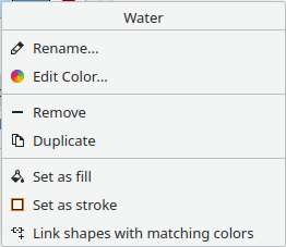
At the top of the menu you see the name of the color
 Rename...
Shows a dialog where you can change the name of the color.
 Edit Color...
Shows a dialog where you can change the color
Remove
Will remove the color from the swatch.
This will have no visual changes, but all objects previously linked to this
color will be unlinked.
 Duplicate
Will add a new identical color to the swatch.
Set as fill
Does the same as clicking
 Set as stroke
Does the same as shift-clicking
 Link shapes with matching colors
Searches the document for all shapes with the same color as the one in the rectangle you clicked, and links them to the swatch.
From Palette
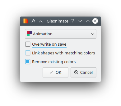
At the top it shows a dropdown with the palettes currently loaded by glaxnimate. The selected item will define the colors used by the document swatch.
To add more palettes, you can do so in the Palette section of the fill View.
- Overwrite on save means that clicking Save Palette for the document swatch will overwrite the selected palette.
- Link shapes matching colors When checked, Glaxnimate will scan the document for objects with colors in the palette and link them to the swatch.
- Remove existing colors If checked, any existing colors in the document swatch will be removed before adding new ones from the palette. Note that this means all objects will become unlinked.
Assets
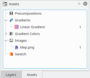
This view shows a list of various assets used by the current document.
Script Console
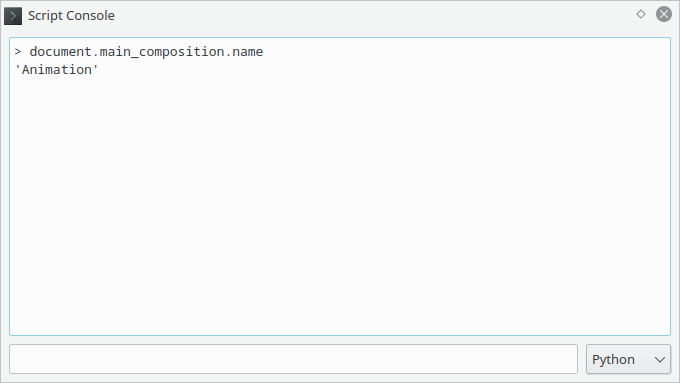
This view (hidden by default) allows you to inspect and modify the open document with Python.
See Scripting for details.
Snippets
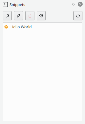
Here you can see "snippets", small python files you can quickly edit and execute.
Useful for testing new scripts when making plugins and to automate certain tasks without having to provide all the metadata required by plugins.
Editing a snippet will open your system text editor.
When you run a snippet, it's equivalent to running that code in the console.
Logs
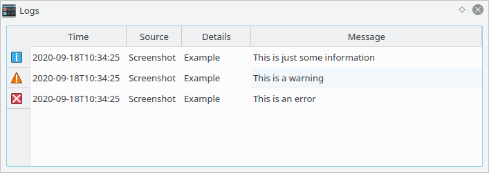
This view (hidden by default) shows internal reporting, errors, etc.